al.
al.
Molzym

overview
(project details)
(now a Bruker company)
Coordinator
Molzym is a German biotech company specialized in molecular diagnostics, with products distributed in over 40 countries. The brand had 20 years of scientific credibility but a visual identity that hadn't kept pace. I led the full rebrand: logo, brand system, and a complete set of marketing materials, completed ahead of the company's acquisition by Bruker.
the challenge
Molzym had built a strong reputation in the lab. The technology was cutting-edge. The brand was not.
The logo hadn't changed in 20 years. The marketing materials were inconsistent, each flyer looking like it came from a different company. The sales team was representing Molzym at 15+ international congresses a year with collateral that didn't reflect the level of innovation behind the products.
And with a global distribution network spanning 40+ countries, every document needed to work across cultures and languages.
The brief: modernize the brand, build a system that holds, and give the commercial team everything they need to sell with confidence. All of this knowing that an acquisition by Bruker was on the horizon, which meant the new identity had to be solid enough to represent the company at a pivotal moment.
the approach
I started by understanding what Molzym actually needed to communicate and to whom. Two audiences kept coming up: the scientist in the lab who needs technical precision, and the distributor who needs a clear, compelling story. Every design decision that followed served those two people.
Logo Redesign

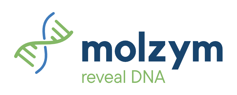
The original DNA helix was recognizable but heavy: gradients, 3D effects, bold uppercase type. I stripped it back. The new logo keeps the double helix but simplifies it into clean, flat lines. The typography moves to a modern lowercase "molzym" in dark blue, paired with a new tagline, "reveal DNA", in green. It says exactly what the company does, in two words.
Color & Typography

The palette stays rooted in blue and green but loses the gradients and gains structure. Deep navy for authority, vibrant green for the science. The typographic system was built around one priority: making highly technical molecular data scannable and readable, whether on a flyer at a congress booth or in a PDF sent to a lab director.
Brand Guidelines

A 20-page identity manual covering logo construction, color palette, typography rules, email signatures, and presentation templates. The goal: anyone at Molzym, in any country, should be able to produce on-brand materials without guessing. This was especially critical with 40+ international distributors.
Marketing Toolkit

Once the system was defined, I rolled it out across every touchpoint the company uses to communicate. From corporate brochures to product flyers, event roll-ups, and global presentation decks. (Details below).
logo redesign
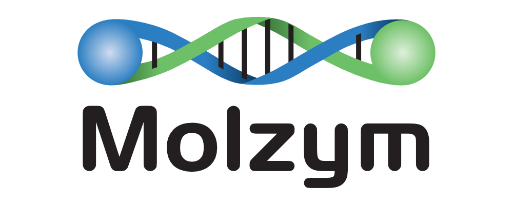
Before: a 3D DNA helix with gradient spheres, bold uppercase "Molzym", no tagline. Recognizable to existing customers but dated, hard to reproduce cleanly at small sizes, and inconsistent across markets.
After: a simplified double helix in flat blue and green, lowercase "molzym" in a contemporary sans-serif, and a new tagline: "reveal DNA". Cleaner, more versatile, and immediately communicates what the company does. Designed to work at any scale, from a congress roll-up to an email signature.
toolkit
(full marketing rollout)
Corporate
Brochure
This didn't exist before. A landscape A4 brochure with two fold-out panels creating a "reveal" experience. Inside: company mission, core technology, diagnostic workflow, and clinical applications. Written and designed for potential partners and existing distributors.
VIEWGlobal Product
Overview
Also new. A landscape A4 document mapping the entire Molzym product range: diagnostic kits, research kits, and workflows. Designed as a visual reference the sales team can walk a prospect through. Dense information, clean hierarchy.
VIEWProduct
Flyers (6)
Six individual flyers. Each follows the same structural template (features, workflow, applications, order info) so that a scientist instantly knows where to find what they need. Every flyer balances technical depth with visual clarity.
VIEWEmail
Signature
A standardized email signature deployed across the company: new logo, contact details, LinkedIn link, all formatted consistently. A small detail that makes a big difference when communicating with labs worldwide every day.
VIEWPowerPoint
Masters
A modular presentation template for internal and external use. Built-in brand rules (colors, fonts, layouts) so the team can build their own decks without breaking the identity. Includes title slides, content layouts, and data visualization.
VIEWEvent
Roll-ups
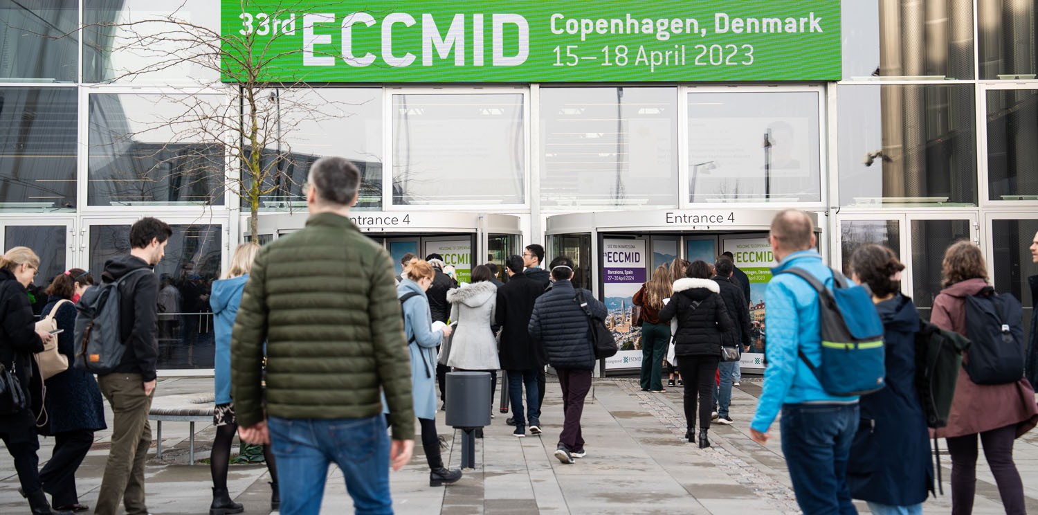
Event roll-ups for international scientific congresses. Designed to be visible and on-brand on a crowded exhibition floor. Used at events including ESCMID Global (16,000 attendees).
VIEWBranded
Goodies
Branded congress giveaways designed to be practical and keep Molzym top of mind after the event.
VIEW